DBS©
Menu
Back to work

SAKI

Brand identity & packaging

A distinct identity for organic beauty, from first impression to packaging.
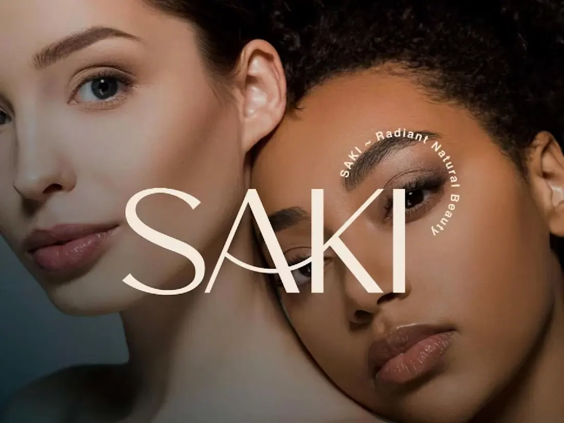
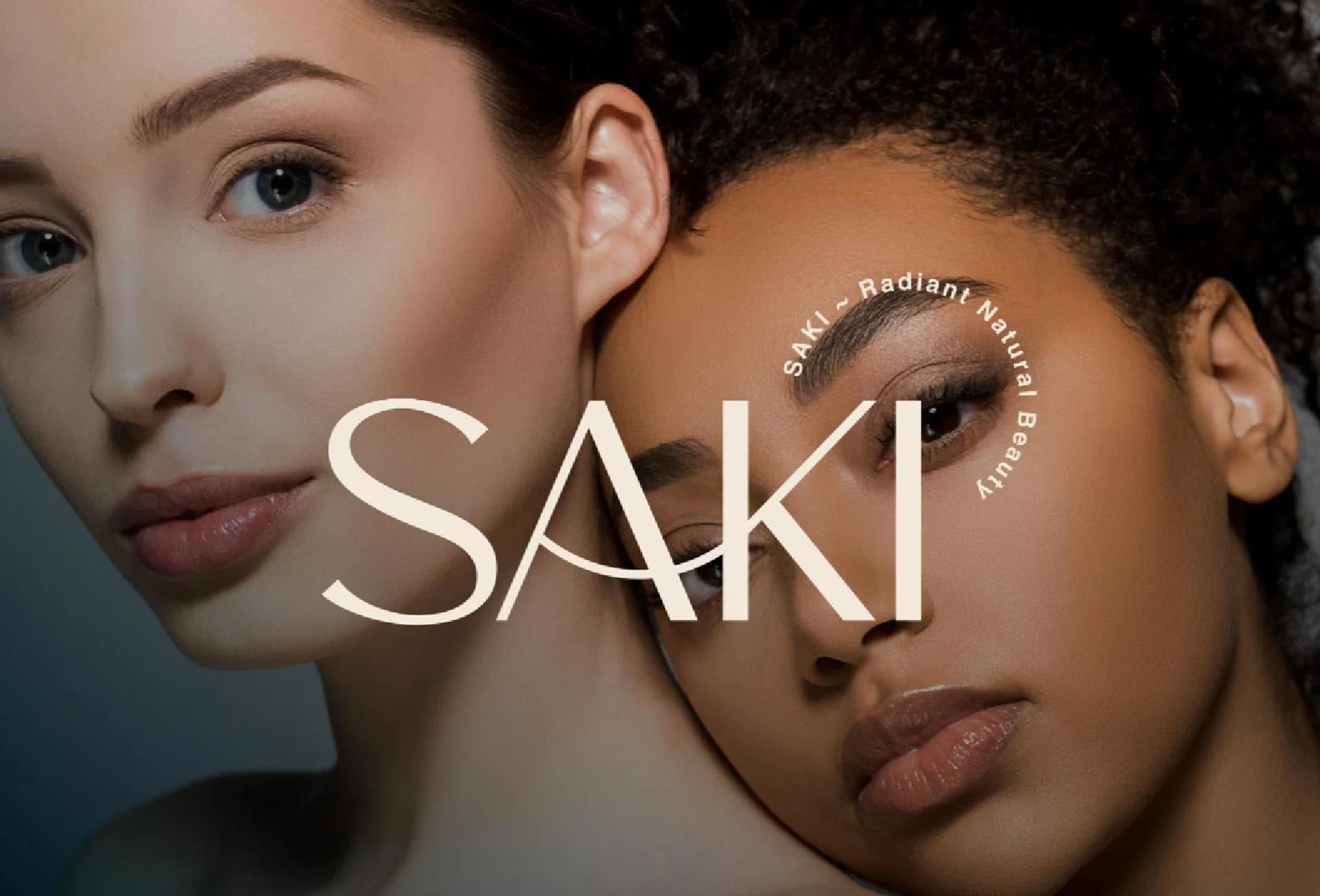
SAKI organic beauty campaign featuring two portraits and a spacious cream wordmark.

The brief

Build a premium visual identity for an organic beauty brand without relying on familiar green-and-brown category clichés.

The approach

An elegant typographic wordmark, a muted palette and a clear packaging hierarchy bring the digital and physical identity together.

Design decisions

Deliverables

Project gallery.

SAKI beauty campaign with two portraits and a spacious cream wordmark.
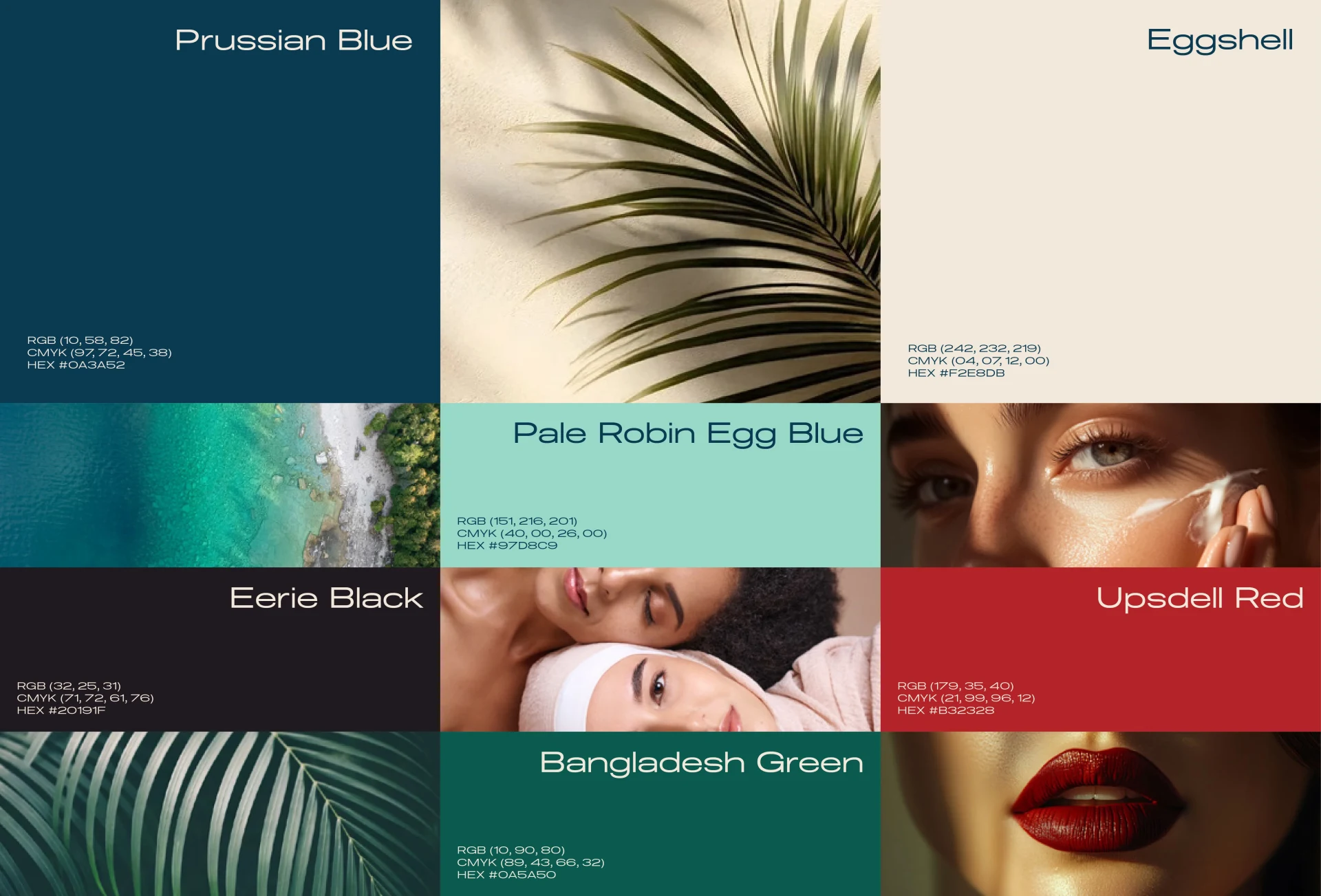
SAKI colour palette pairing deep teal, mint, cream and red with botanical and beauty photography.
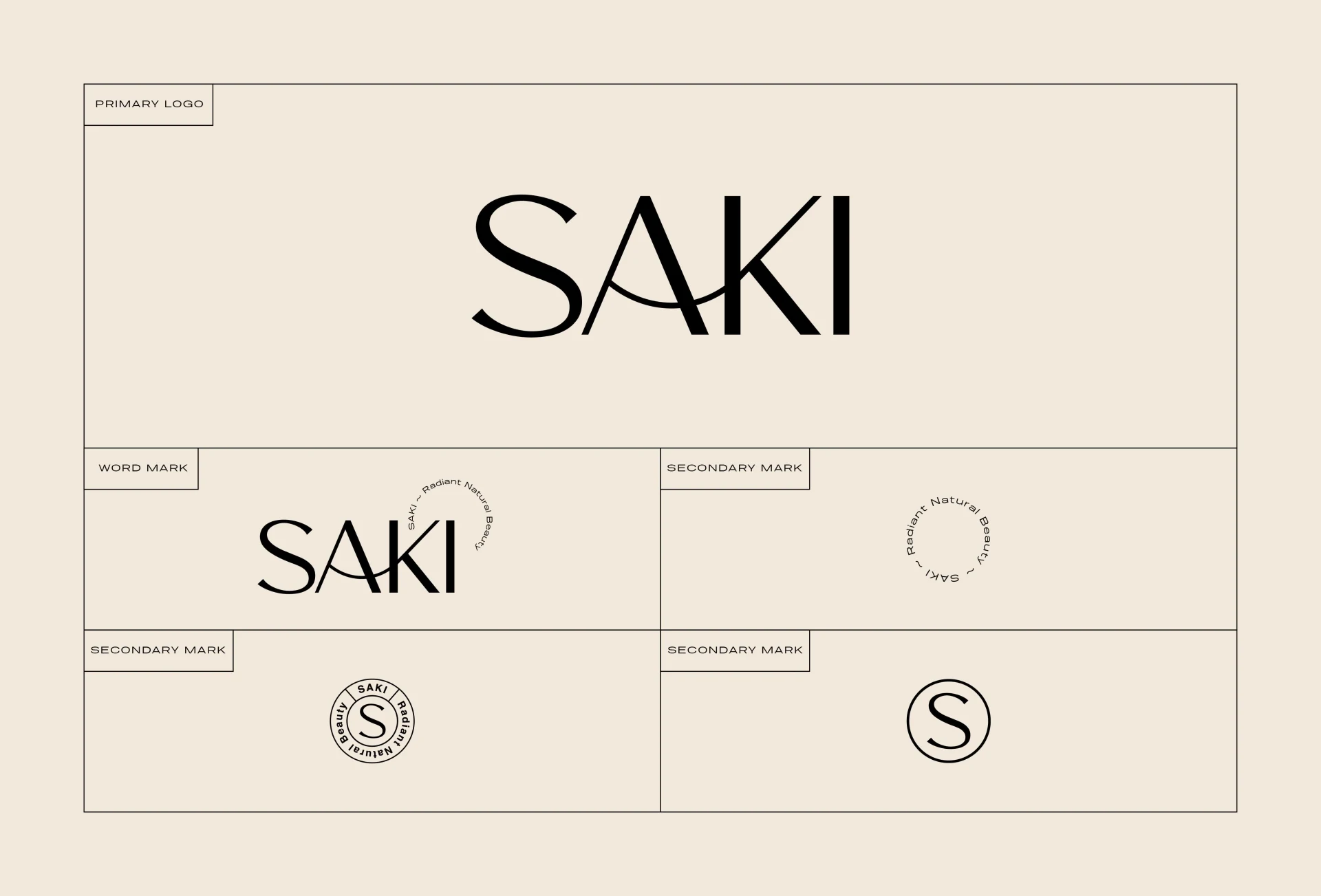
SAKI wordmark, monogram and circular logo variations on cream.
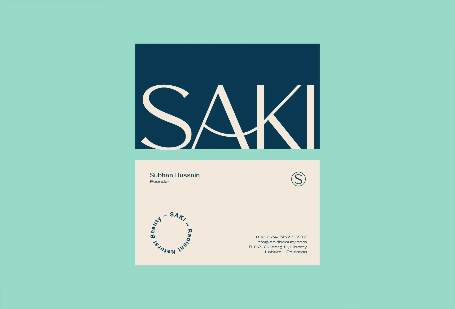
SAKI business cards in cream and deep teal against a mint background.
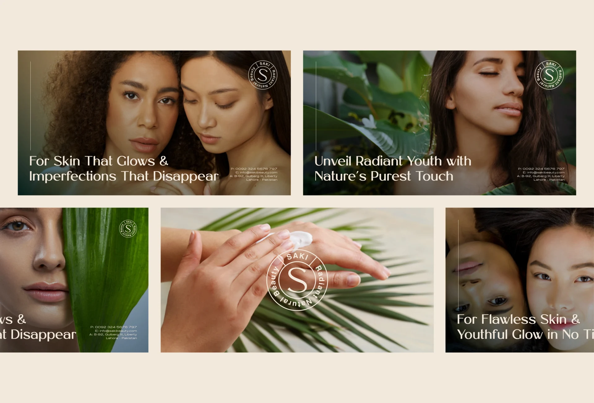
SAKI social campaign layouts combining portraits, nature imagery and skincare messages.
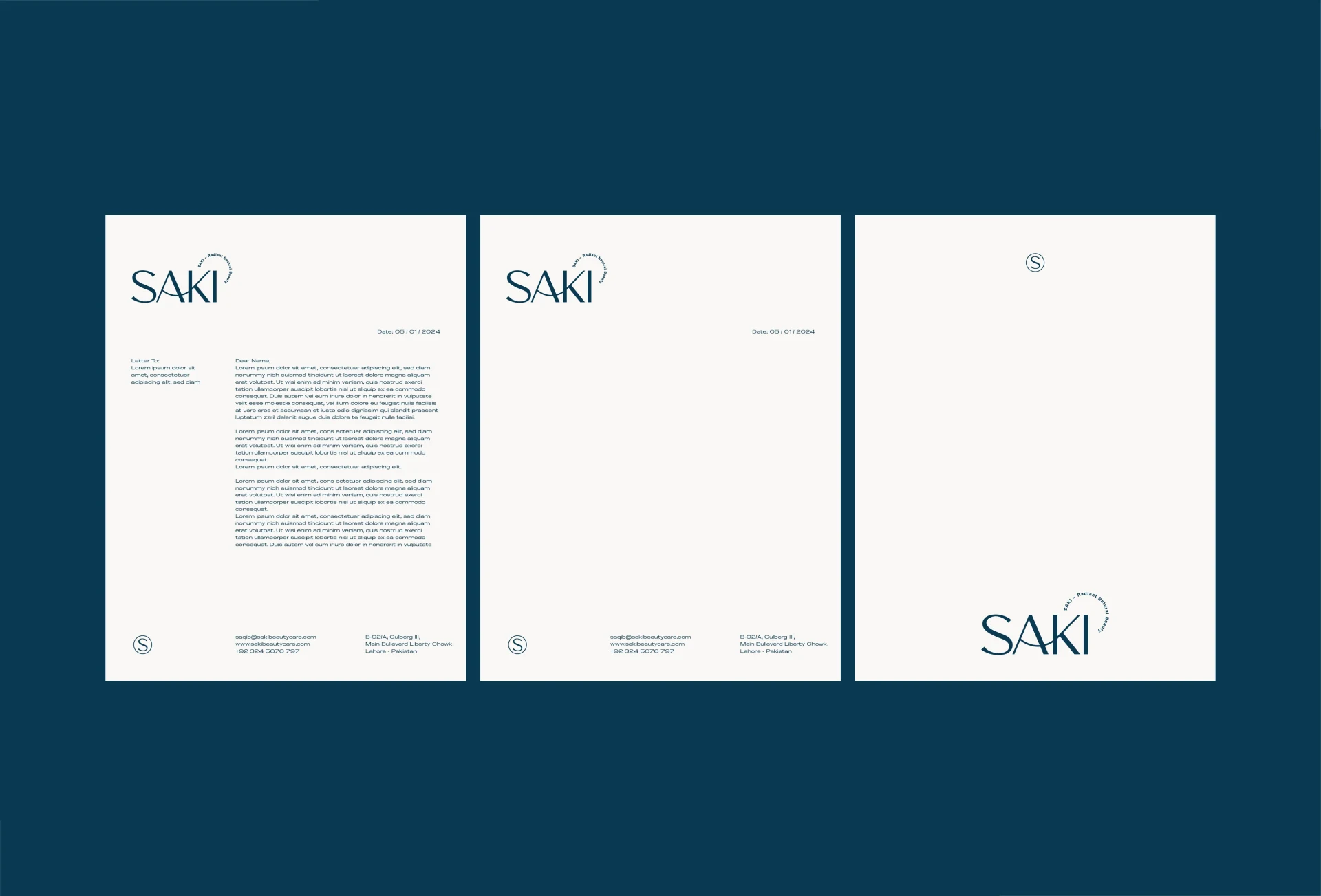
SAKI cream letterhead and stationery system against deep teal.
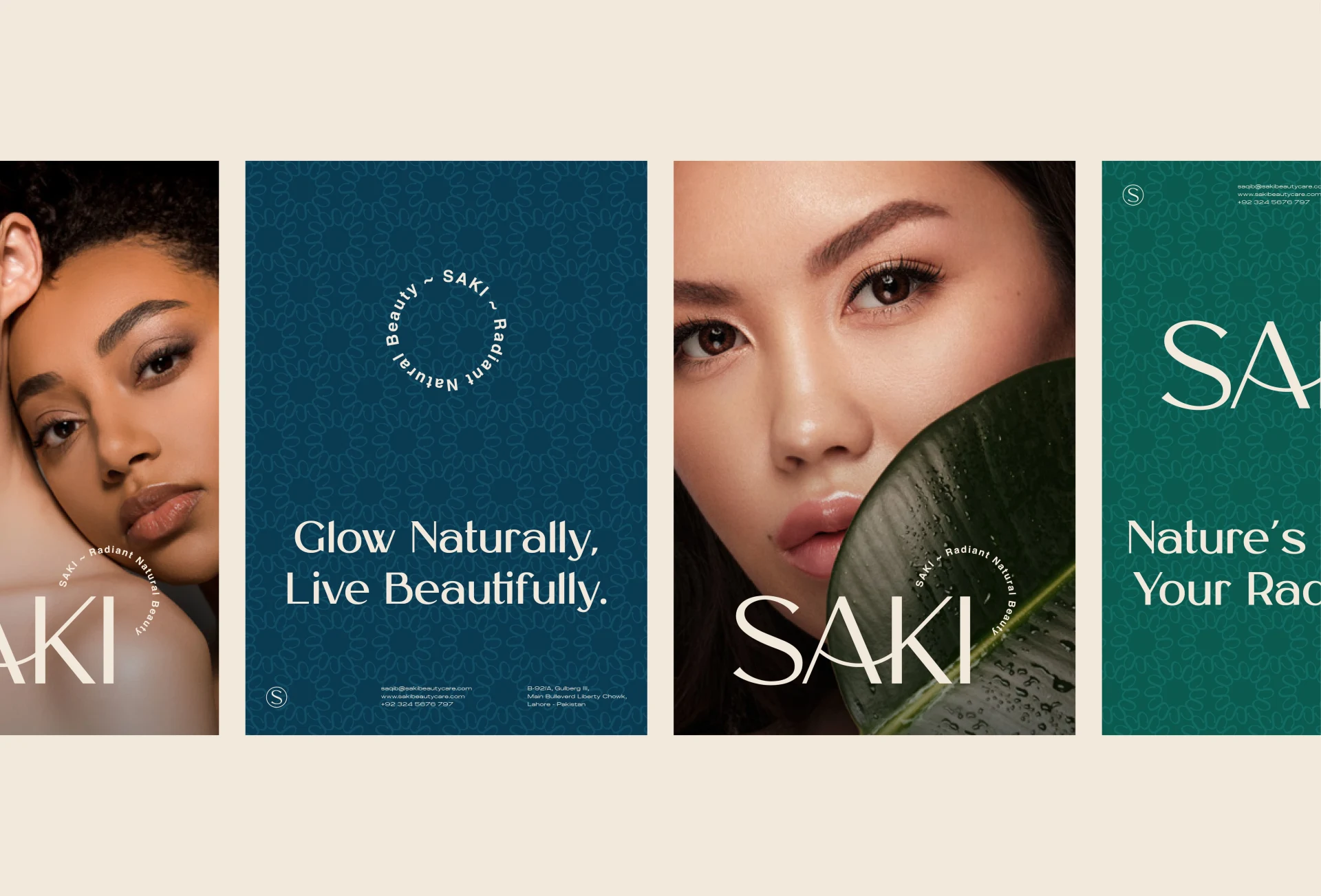
SAKI portrait and typographic campaign posters in teal, mint and cream.
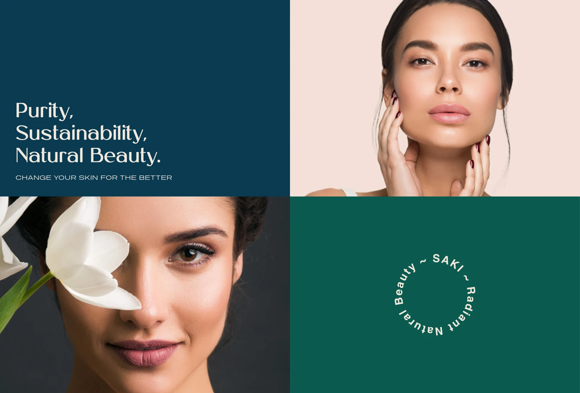
SAKI brand collage pairing beauty portraits with purity and sustainability messaging.
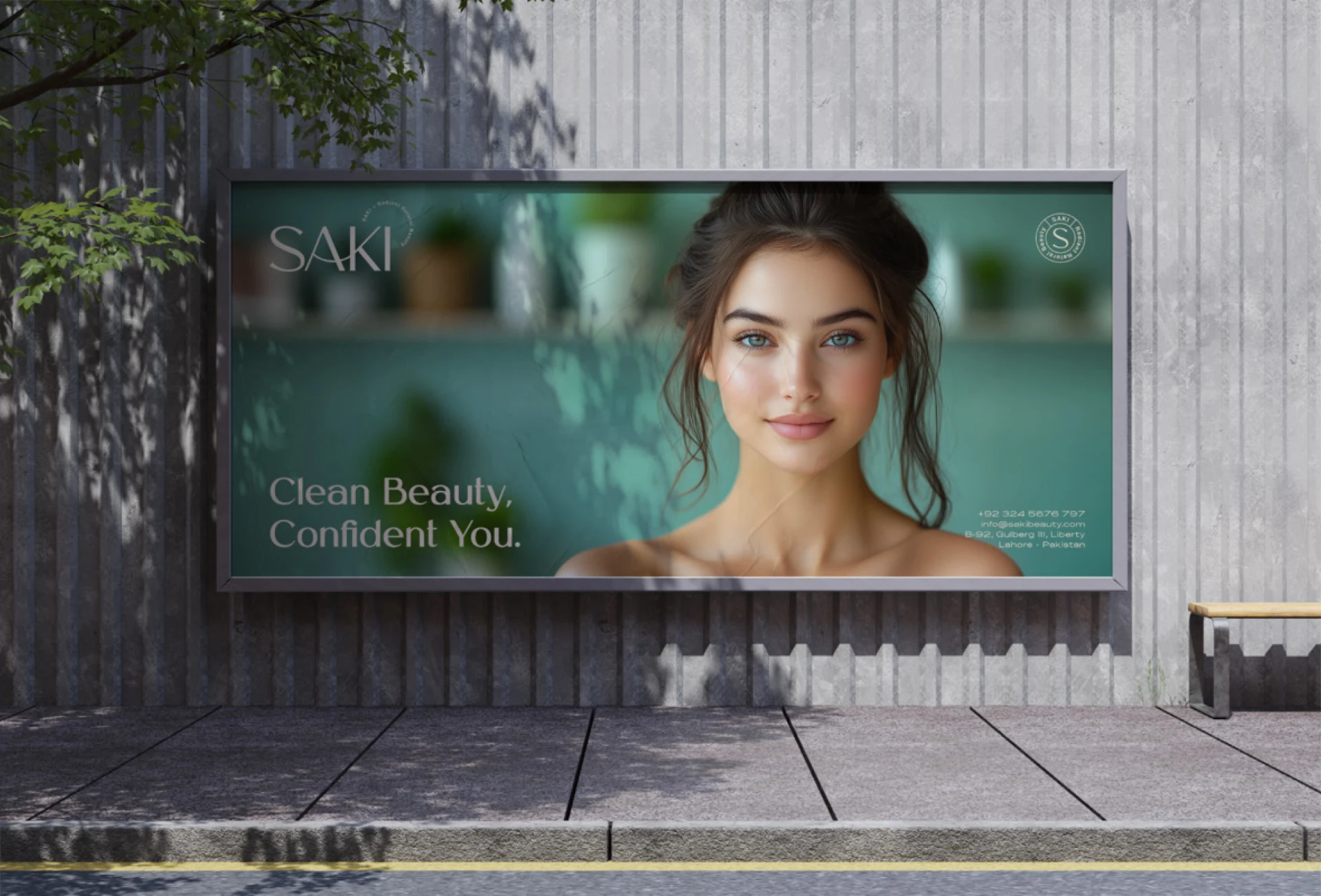
SAKI clean-beauty billboard beside a concrete wall and greenery.
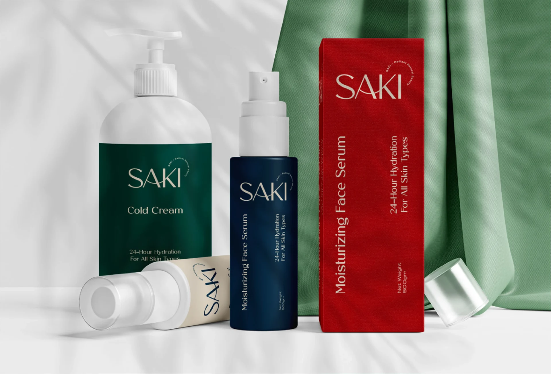
SAKI skincare bottles, tubes and red packaging arranged on white fabric.
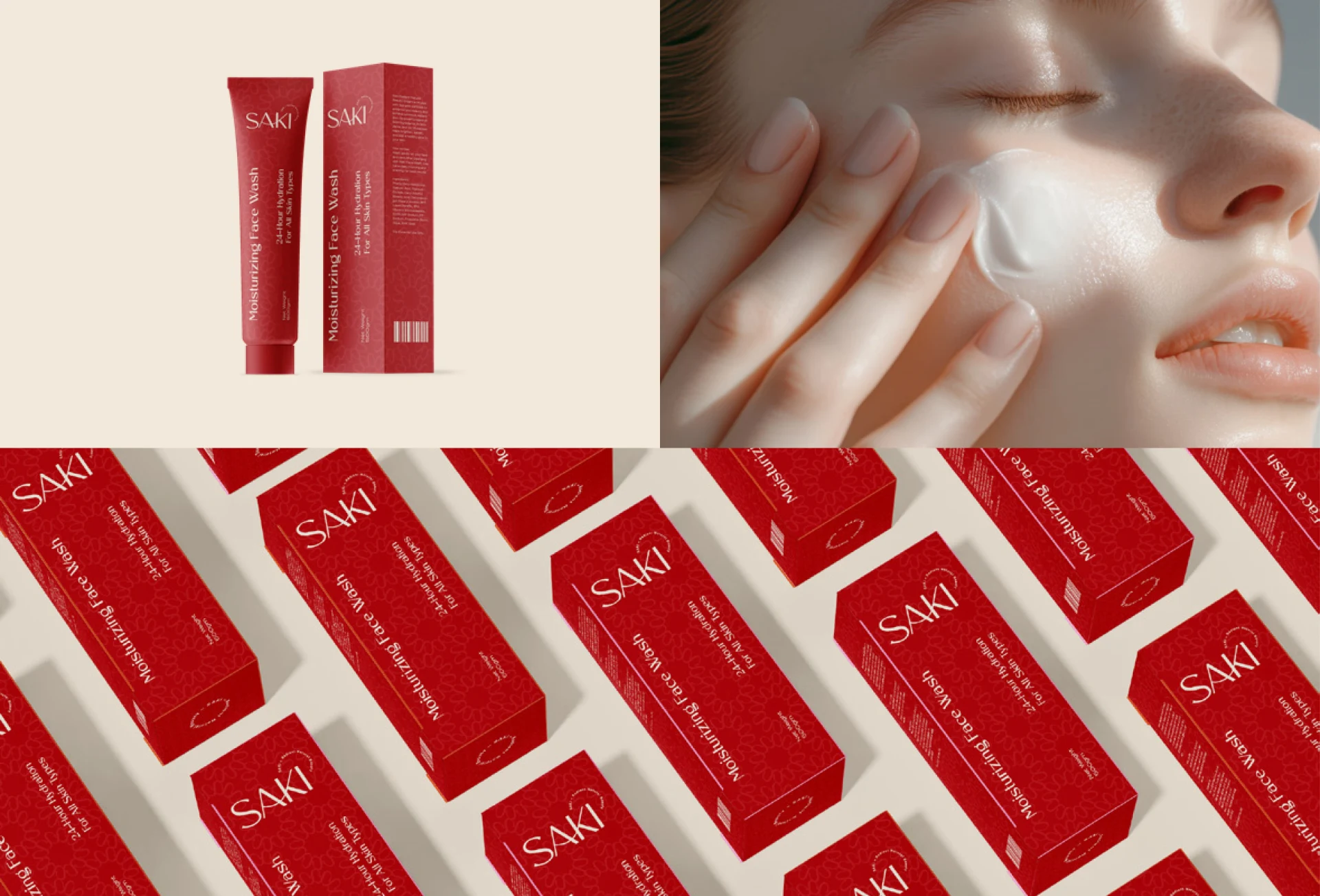
SAKI red skincare packaging alongside a close-up cream application photograph.
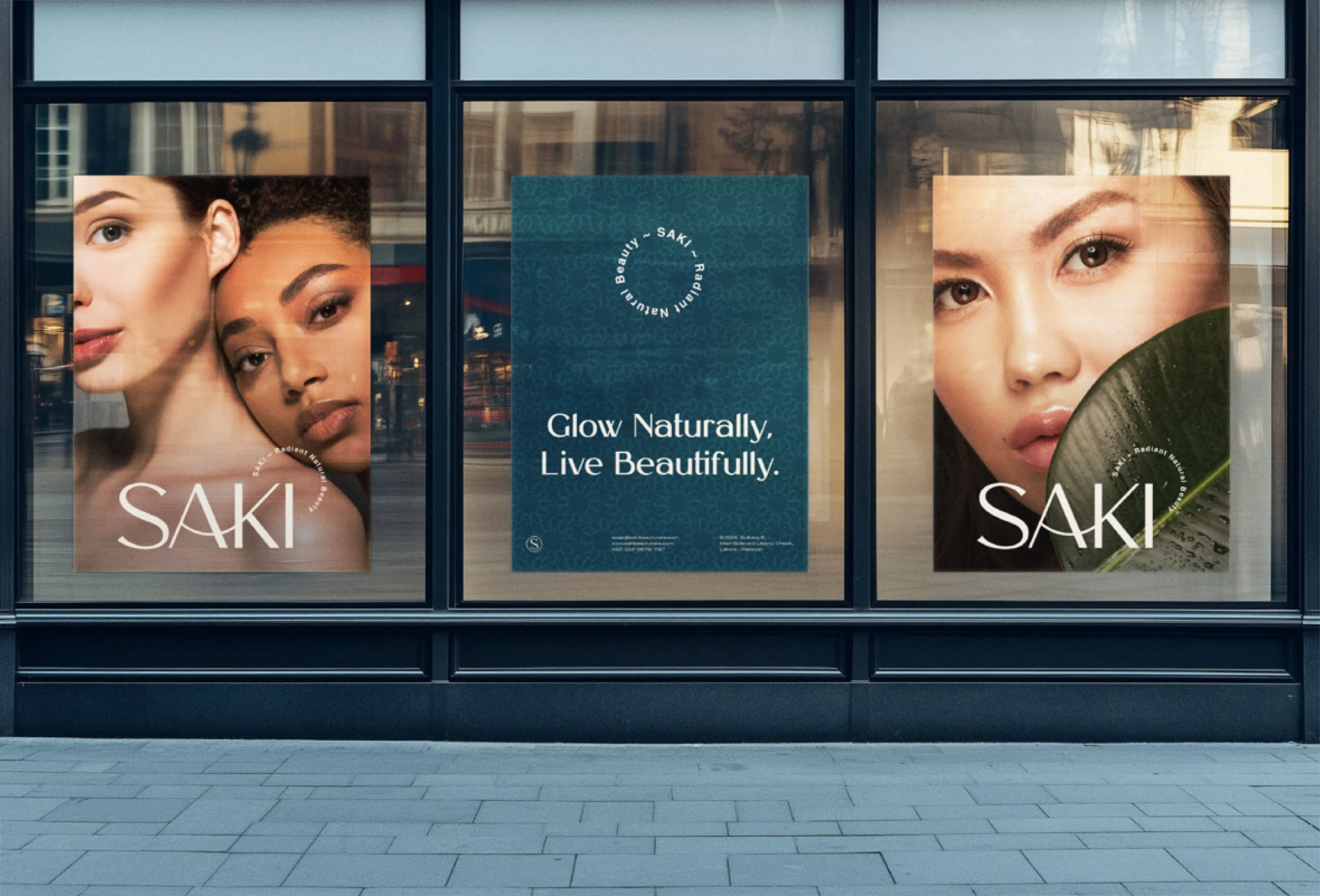
Three SAKI campaign posters displayed in a shop window.
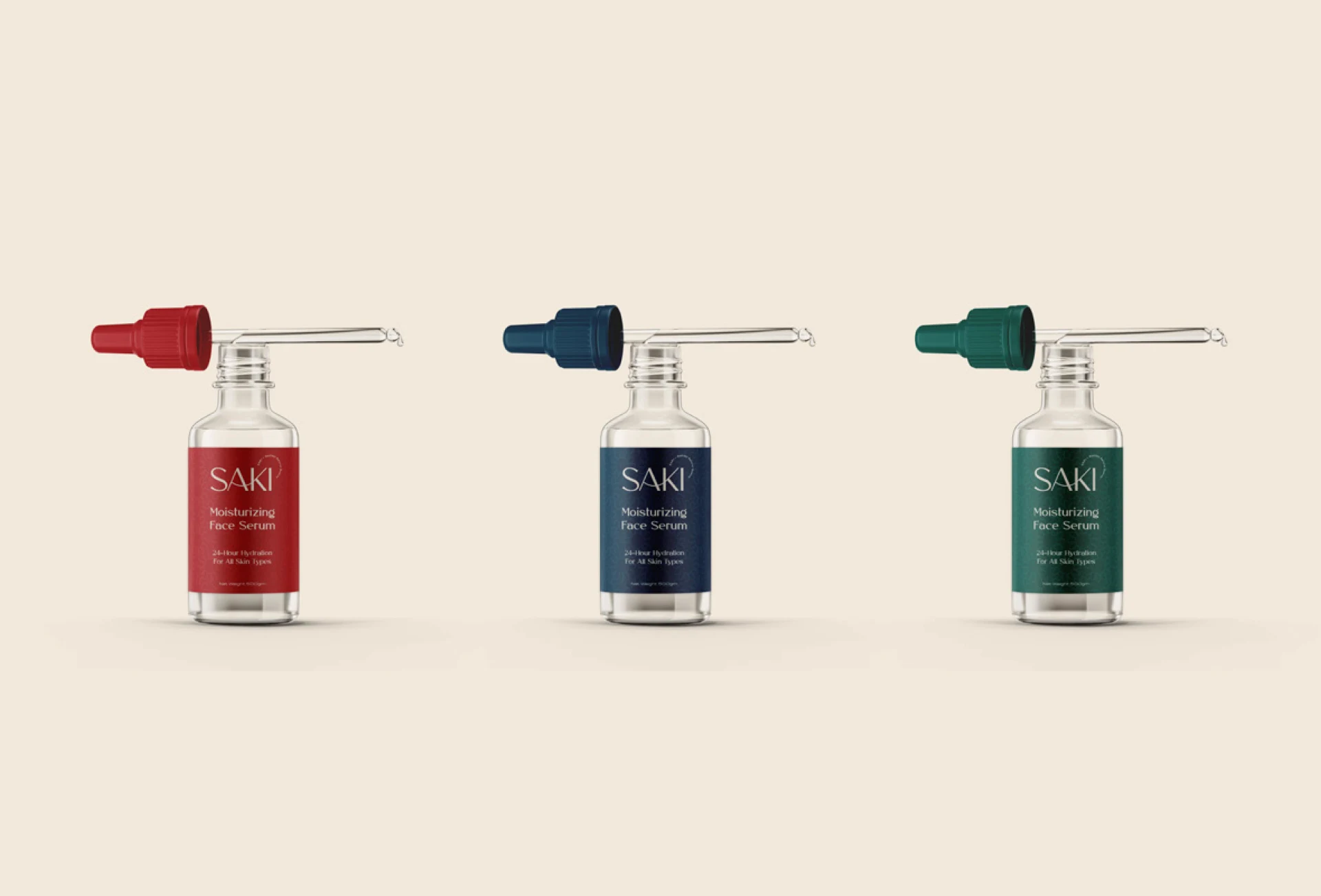
SAKI serum bottles with red, blue and green droppers on a cream surface.
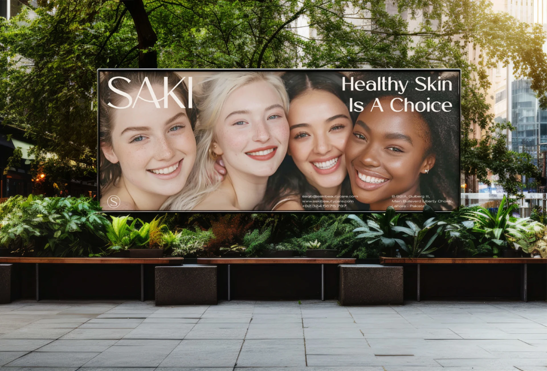
SAKI outdoor billboard with three smiling portraits and healthy-skin messaging.
Next project: Brasserie du Primerose Start a project