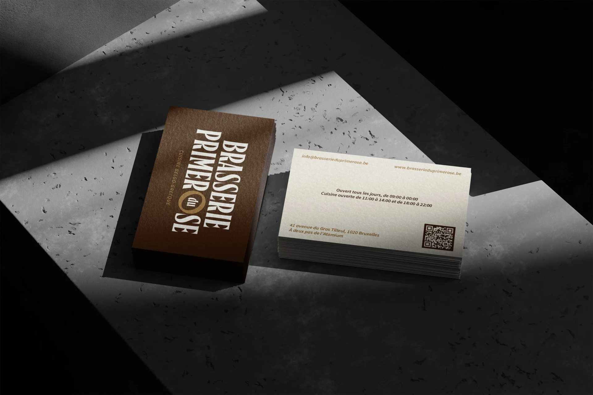
Brasserie du Primerose
Hospitality identity & menu design
Belgian classics and Greek specialties, brought together through one restaurant identity.
The brief
Bring two culinary traditions into one clear, welcoming identity for a Brussels brasserie near the Atomium.
The approach
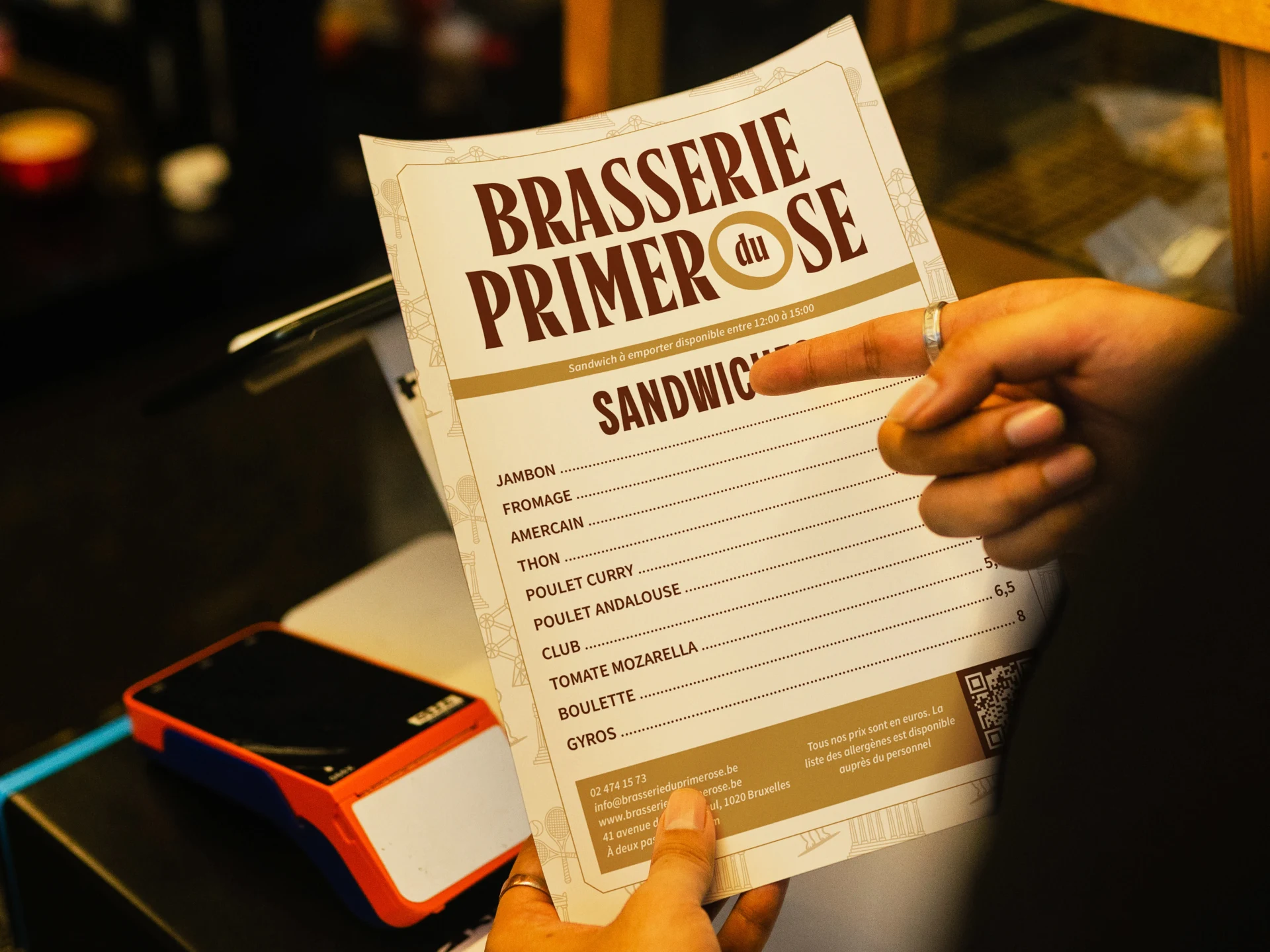
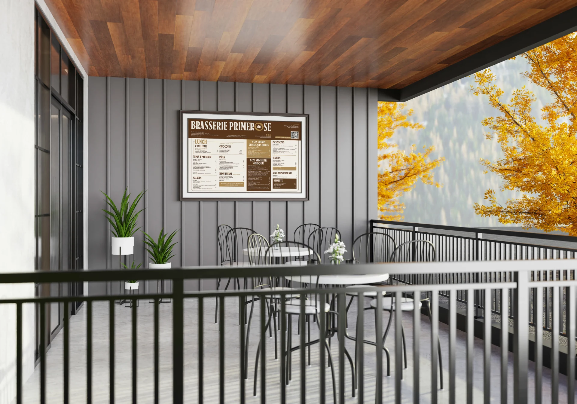
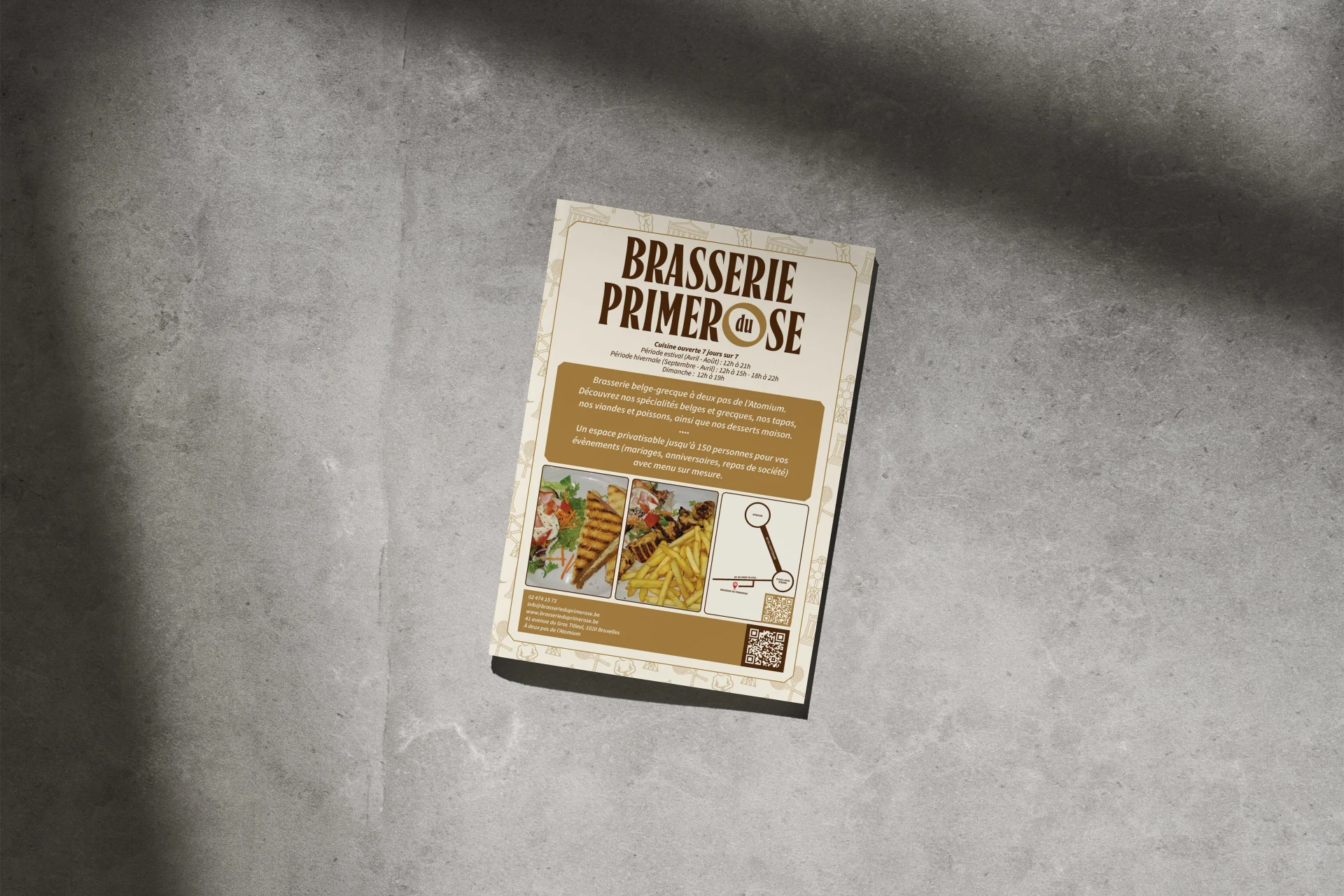
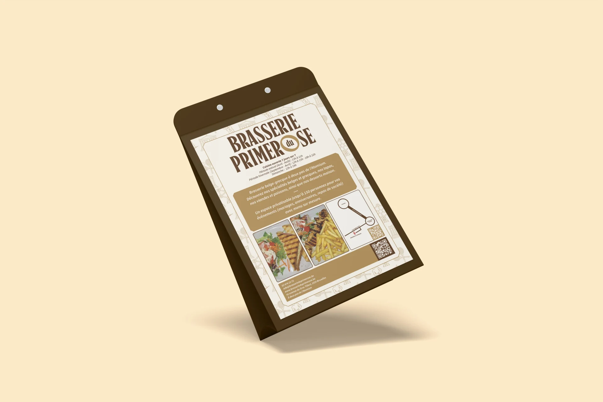
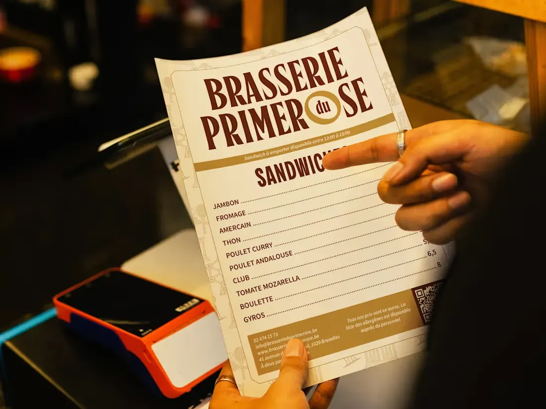
A warm chocolate-and-cream palette, structured menu typography and location-inspired line art connect the restaurant's menus, signage and print materials.
Design decisions
- Separate Belgian classics and Greek specialties with clear menu hierarchy.
- Use Atomium-inspired illustration to connect the identity to its setting.
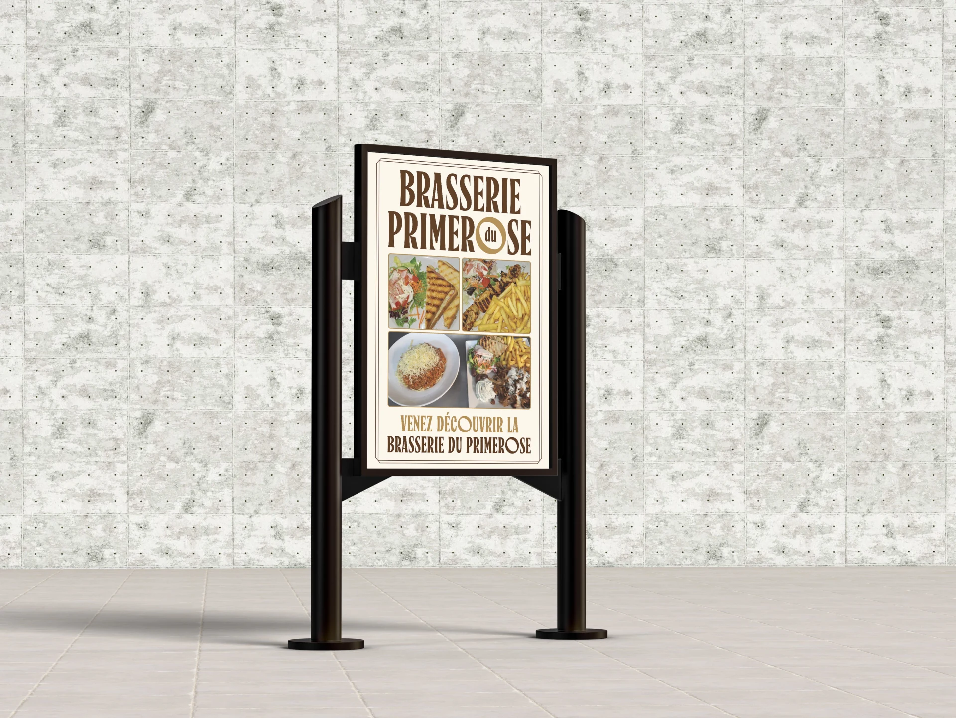
- Carry the same warm visual language through the dining touchpoints.
Deliverables
- Visual identity system
- Menu design
- Environmental signage
- Print collateral
Project gallery.